Serious photographers have gained at least a beginning understanding of color spaces and their importance in appropriately representing and displaying color images. We’ve learned that the smallest color space, sRGB, is the default color space for images for web display. I’ve recently learned an abject lesson in what happens when one posts images to the web in ProPhoto RGB, the widest gamut color space generally used for photography. I want to share my learning in this post.
Color Spaces
A color space defines the range of hues and saturations that can be represented in the space. For most photographers, the color spaces of interest are sRGB, Adobe (1998) RGB and ProPhoto RGB. sRGB was defined in the 1980s around the limited set of colors reproducible on then state of the art CRT monitors. In the late 1990s, Adobe RGB expanded the range of colors that could be represented, particularly expanding the range of green hues and saturations. In the early 2000s, ProPhoto RGB defined a maximal color space, further expanding especially the greens that could be represented. ProPhoto is large enough that it encompasses some colors that are not seen in nature.
Serious photographers have also learned to do post processing in the ProPhoto color space, and to develop and maintain a color-calibrated and color-managed working environment consisting of their PCs or Macs, display adapters, color displays, and color managed applications such as Adobe PhotoShop, Adobe Lightroom and Microsoft Word. Finally, we have also learned to convert final images to a color space appropriate for the intended use of the image.
We understand that sRGB is the default color space for the web. Relatively few web applications (image galleries, websites, browsers, etc.) implement color management so sRGB is the least common denominator for the web.
I have recently posted a new gallery of images from a regrowing redwood forest. Color temperatures of light in the forest are very different from normal daylight. Ambient light is largely light that has been diffused through a green forest canopy and then scattered from brown bark and dried, red needles. The light is very greenish and very blue deficient. Images captured in this environment truly benefit from the expanded range of greens that are in ProPhoto or Adobe RGB color spaces.
Unfortunately, web applications such the platform and gallery management software on my website, like most websites, are not color-managed work spaces. Those web applications do things like create thumbnails, various image sizes different from an “original” image and so on. Give those web applications an image in wide-space ProPhoto RGB and the resulting web application generated images can have horrid color casts that one never expected.
Images from the Stout Grove
This image was shot in the Stout Grove of the Redwood National and State Parks in northern California. The image was captured in Nikon raw (“NEF”) mode and imported to Lightroom and Photoshop where I use ProPhoto as my working space. Using Photoshop’s soft proofing features, one can learn that many of the greens of the ferns in the lower-left of the image are outside of the sRGB color space while a small fraction of the ferns lie outside of the Adobe RGB color space. I created five JPEG copies of the image, one in ProPhoto, two in Adobe RGB (one converted with relative colorimetric intent, one created with perceptual intent), and two in sRGB (again relative colorimetric and perceptual intents).
Thumbnails appear in this order: ProPhoto, Adobe RGB Relative Colorimetric intent, Adobe RGB Perceptual intent, sRGB Relative Colorimetric, sRGB Perceptual. My website gallery management software created the 300 pixel thumbnails from 1584 x 1056 pixel images. (These thumbnails are larger than normal to help demonstrate the color casts.) When you click on any thumbnail, you will start a slide show that presents the 1584 pixel images.
Clearly there is a strong green cast on the thumbnail of the ProPhoto image and a slight green cast on both thumbnails of the Adobe RGB images. The web gallery manager used the extra color information in the images in ways I did not expect when it created the thumbnails. Expand the images in the slide show view and they all look about the same and about as they do in my color-managed environment.
Images of Mushrooms on the Forest Floor
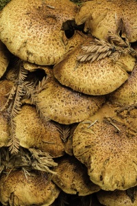
Here is a gallery of images of mushrooms on the forest floor. The original TIF image is again in ProPhoto color space. Soft proofing for the Adobe RGB color space shows a small fraction of the faces of the mushrooms lie outside the Adobe RGB color space. Soft proofing for sRGB shows that most of the faces of the mushrooms fall outside of the sRGB color space.
Thumbnails appear in this order: ProPhoto, Adobe RGB Relative Colorimetric intent, Adobe RGB Perceptual intent, sRGB Relative Colorimetric, sRGB Perceptual.
The green cast on the orange mushrooms in the thumbnail of the ProPhoto image are horrid! A slight green cast is visible on the images in Adobe RGB while the images in sRGB look fine. Expand the thumbnails to full size and all five images look about the same and pretty much as I intended.
Aside: It does look as though the gallery management software is also increasing the saturation of the thumbnails. That’s probably a good idea for very small thumbnails, less so for the extra-large thumbnails I’ve used here to demonstrate the color casts.
Lessons
- The World Wide Web is not a managed color space! Once you place an image on the web, you must assume that no application will pay attention to its color space and behave appropriately. The web environment is not color-managed.
- The safe assumption for the web is sRGB. Far better for you to manage the conversion of an image to sRGB (using capable applications like PhotoShop). If you place an image on the web with wider gamut color information you are hoping for the best. Your hopes are likely to be dashed.
- The examples I’ve used, images captured in the forest with its unusual ambient light, are probably extreme examples. The ProPhoto images from the forest contain a lot of information about the greens that will be missing from an sRGB-based image.
- Still, the lesson should be clear: images posted to the web should be in sRGB! Do not forget it.
Acknowledgement
Many thanks to Pascal Jappy, editor of the wonderful photo website DearSusan.net. I had submitted a post about my redwood forest project to Pascal for his consideration. He astutely caught the nasty green color cast in the images as he was preparing to post the images to DearSusan. Pascal’s patience, help and encouragement has been invaluable to me in resolving the issue.

